With professional insight from Guðmundur Ørn Ísfeld – RPM Records CEO and graphic designer, we tried to answer the most common questions we thought you might have when it comes to vinyl cover art.
In 1938, Columbia Records hired graphic designer Alex Steinweiss as an art director. He soon went on to invent the concept of album covers and cover art, replacing the gray plain covers used before. Quickly after, other record companies followed his lead and featured their own colorful paper covers for both 10 and 12-inch vinyl records.
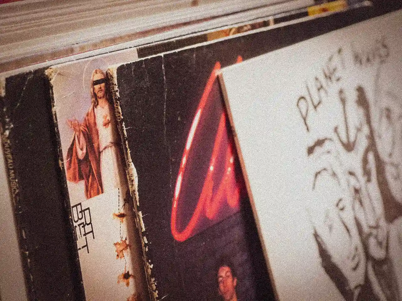
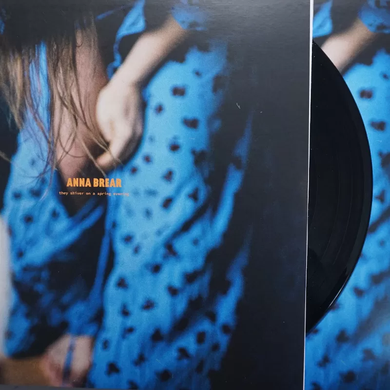
Some say to never judge a book by its cover, but to this day, vinyl artwork is just as much a part of the identity of a record as the spiraling grooves that make it sing.
What you will learn
-
How great vinyl cover design helps your record stand out and sell
-
What makes a front cover grab attention (and what to avoid)
-
Tips for choosing colors, type, and imagery that fit your music and brand
-
How to design the back cover for clarity, credibility, and style
-
Why spine details, inserts, and material choices matter more than you think
How important is vinyl cover design? What is the purpose of it?
Vinyl cover artwork is important for many reasons. It has the power to be a complementary force for boosting record sales, or if neglected, it can have the opposite effect. Imagine you are digging in the crates in a record shop and you are just looking through random records. Many times, your choices are guided solely by the mood and message that the artwork of an album conveys.
Apart from the utility of recognizing specific records, album covers serve the purpose of communicating the message, by means of photography, graphic design, or illustration.
Most record collectors state that one of the main reasons they fell in love with vinyl is that you can see the artwork in 32 cm x 32 cm format. And also if you are the kind of person that enjoys sitting and intensely listening to music, you like to look at the cover and analyze it as you would look at a famous painting. Therefore, it should not be overlooked.
Music has the power to drive important changes, and so does the artwork if treated accordingly. It can communicate a meaningful message to the world.
Is the album artwork as important as the music?
“Well, there wouldn’t be any cover artwork if it weren’t for the music, but there would be music if it weren’t for the cover… So I wouldn’t say as important, but pretty damn important. It also depends on who you are. There are so many musicians that really focus on the artwork and make it insanely important. And some genres, like punk or electronic, come on a white label… which is also cool. So it really depends on the artistic direction you are taking. Just take The Dark Side Of The Moon; it is a cover that, in many ways, says very little, but having heard the music, you get how it is about expanding your mind, and just seeing that cover or illustration sends you to a state of mind” Guðmundur Ørn Ísfeld.
What should musicians have in mind when planning the cover art for their vinyl project? Who should design it?
When developing the vinyl record design, one should definitely be mindful of the style and the artwork itself: A mirror of the music genre. Make sure that it represents your music in one way or another. Try to focus on your identity as an artist, band, musician, etc. What defines you? That is, of course, if you want to be noticed; some are happy with not being seen.
If your music is on the experimental side, you would have to make the cover match that, then experiment with your cover art. If you are trying to sell yourself as, i.g. a front person or an image, it is a great idea to have yourself on the cover. Different music genres tend to follow certain design styles. A lot can be lost in sales if you don’t focus on that. Know your audience! If your hip-hop album artwork looks like a black or death metal cover, it could easily be overseen by your ideal listeners. At least don’t make it look like something completely different unless you’re so well-known that you can do it. You could also make the artwork yourself; you don’t have to be a pro. Although, if you have never done graphic work before, look for inspiration and do plenty of research. Look at the best 100 record covers, blend your favorite ideas… Don’t be shy to ask for advice or help from your design friends; also, reach out to someone studying graphic design so often; someone making their portfolio would love to help out for a reasonable price. Of course, if you have the budget, then hire a professional.
If you don’t know a professional, you can always contact your pressing plant; they might very well know a top-of-the-line designer they can recommend.
“Basically, the classic mistake for beginners is not knowing the difference between RGB (digital) and CMYK (print). It’s very difficult to change between these two color models after you’ve designed the cover without colors being altered“
Guðmundur Ørn Ísfeld
Where to find the correct sizes, formats, or vinyl cover templates?
7 inch and 12 inch vinyl artwork templates, as well as the free center label templates, can be downloaded anytime from the RPM Records Homepage. If you are interested in any other options we can send you the correct template.
How can you check if the cover art design is correct before you submit it? What are the most common mistakes?
Be sure to check if you are happy with the design, the colours, and the layout, by printing the final vinyl design template on a regular printer. That way, you can make the needed adjustments before sending it to the pressing plant. For example, examine if the fonts have a proper size balance in the artwork.
Before submitting your design, go back to our website and do the checklist. If your cover artwork checks all the points below, you should be good to go.
-
CMYK color;
-
5mm bleed on the edges of the covers;
-
At least 300 dbi/ppi;
-
Exported as Acrobat 1.3 pdf;
-
All fonts need to be made into objects:
Illustrator “Create outline” function Photoshop “Convert to shape” function InDesign “Create outline” function
-
PDF 1:1, exported or distilled without scaling;
-
Partial varnish, hot foil or embossing on exact position in 100% with one color in a separate page or less;
-
Without visible cutting lines, folding lines and punching lines, instead – if necessary – cutting and folding marks;
-
Outside the bleed area – this is also binding for colour bars;
-
Single placed and centered per page for multi-part products, f. e. labels or booklets (single pages or imposed double pages) or similar.
Lines and font sizes
-
The thicknesses of lines have to be no less than 0.15 mm in the positive printing and 0.25 mm in the negative printing;
-
Line thickness for hot foil and embossing have to be at 0.35 mm;
-
Fonts should have a minimum size of 5pt for positive printing and at least 7pt for negative printing.
Colours
-
Black text and lines should be adjusted to overprint with CMYK backgrounds, for metallic and daylight colors there should be no overprint command;
-
In combination, the summary of all colours should not be higher then 280% for the ink coverage;
-
For deep black effects of 100% black you should under-layer the black with 50% cyan (100% black and 50% cyan);
-
White fonts on deep black in 1C should consist only of 2 colours, black (+ 50% cyan), not more.
What is the essential information the album cover should contain?
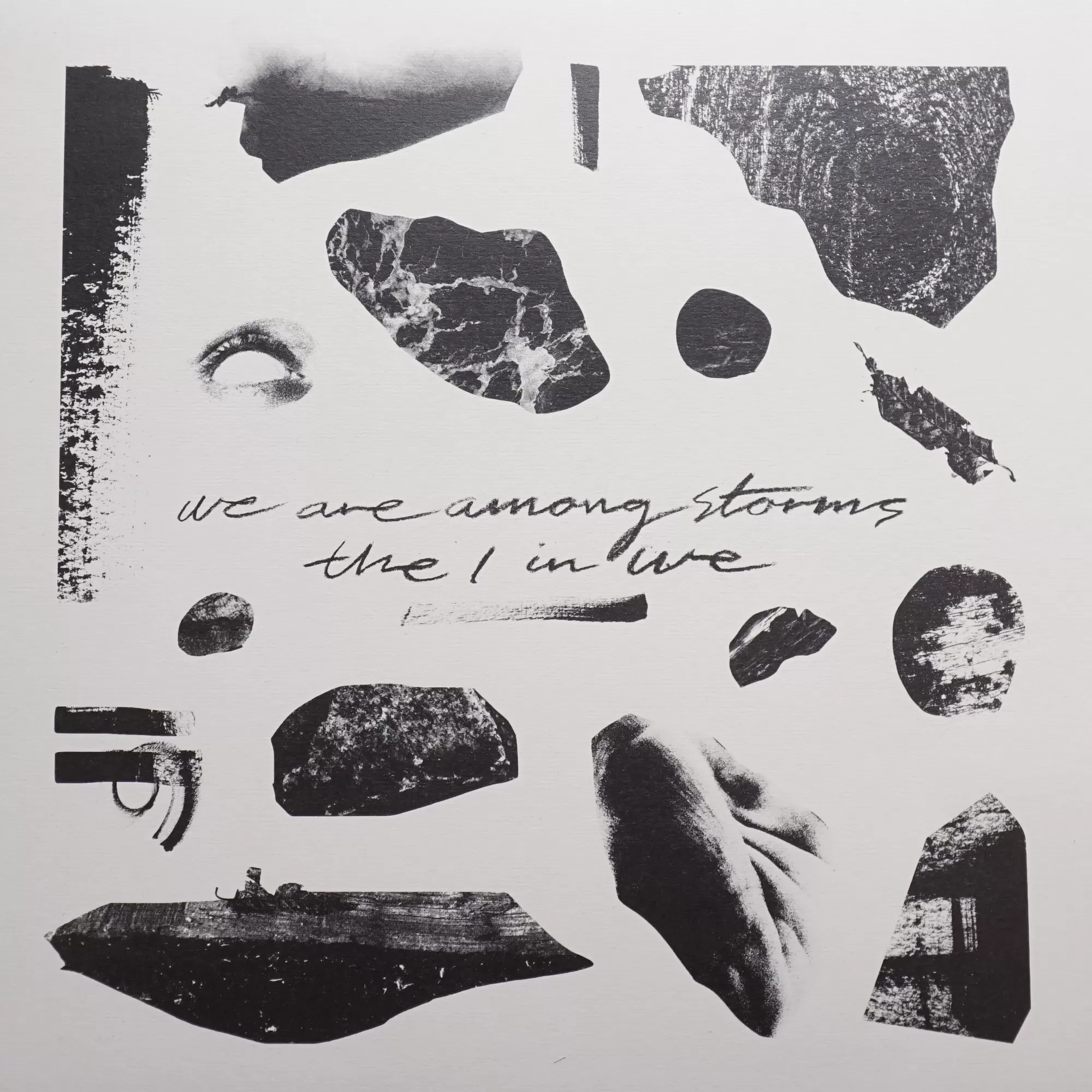
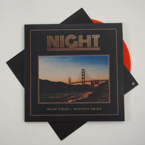
Unless it interferes with your design concept, the vinyl artwork should follow the classic specifications for an album. Usually, the front cover contains the name of the artist/ band, as well as the name of the album release. This a rule of thumb, but some choose to do it in an unconventional way. You can too.
Some people skip the text on the spine and I think that’s a real waste… What I always recommend to everyone is to get the artist/ band name on the spine and top of the spine so that it pops out from different displays, in a crate, and in a shelf!
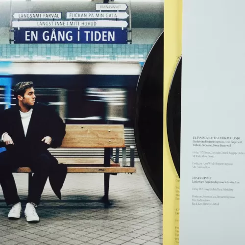
The back cover of the album should include the album’s track list and play-times. The typography can be different here than on the front cover, but it should still communicate stylistically and be easy to read.
Remember to have a space on the back cover or inside for licensing and legal information. Record labels might also want to include catalog numbers. A cute picture of your band is always welcome too.
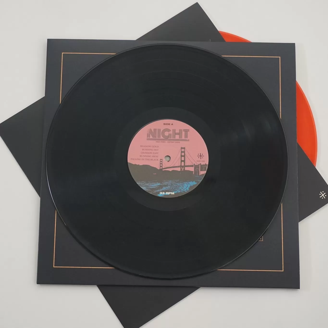
What about center labels?
Center labels are the round papers in the middle of the record. In the vinyl production process, they are baked to remove all moisture, and then literally pressed into your records at the same time the grooves are being stamped. On the center labels, you really want to make sure you write which side is which, and the names of the songs on each side. Make sure you got the track list right. You can also assign one side with INFO and leave the other side for the artwork. The speed of the record is also an important detail. Not everyone follows these standards, but often, depending on which side spins faster, you can use the design to create a visual effect.
RPM offers the option to press records with blank center labels, no center labels at all, or fully printed.
Lastly, if you are a musician and you are involved in the artwork creation process, keep in mind that you might be signing the record. In that case, make sure that you leave space for your signature on the cover/ where you’re going to sign it, draw on it, screen-print etc…
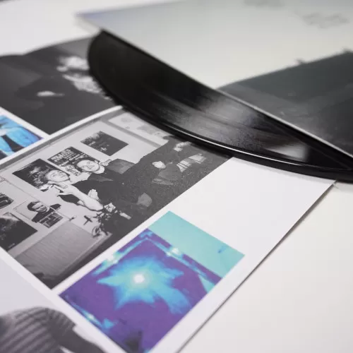
What are the available colors, paper options? How do particular colors print on particular papers? How far can customization go?
As a standard, we print on 300 GSM (gram/sqm) gd2 cardboard, white/ white. Our latest popular option is circle offset.
The choice of paper can help bring depth to your album artwork design.
From recycled, plain, brown, to holographic, RPM Records can provide any kind of paper you could think of for your vinyl release.
-
Brown paper looks great with one color print/ screenprint. Its clean and durable fiber content and its low cost make it an ideal option for heavy-duty applications that require a high level of tear resistance. It looks amazing with black ink, other colors look more faded, like an old tattoo.
-
UV glossy paper goes well with an “artificial design”. It will give your artwork a rich, glossy, and dramatic look. It makes the printed cover eye-catching.
-
Semi-gloss or “luster” paper offers a good compromise between glare, color range, and durability. With a color range close to that of glossy paper, you can be sure you are getting the full printer power while at the same time reducing glare and smudges.
-
Matte paper is preferable because it’s more robust. Not only is it less sensitive when it comes to fingerprints, and it’s also more resistant to light. It is a standard because it works well for mostly everything.
-
Reverse paper is the best for illustrated pictures, a drawn picture, or a painting. It has a canvas feel to it and is often our top recommendation because of its durability and versatility.
What can be done with screen printing?
Our partner, Ice Screen Printing, can work magic on covers, inner sleeves, plastic sleeves, stickers, and even the blank side of your record for more minimalist designs with up to 3 colors. If you go the extra mile and screen print, the coolest thing would be to do it on the actual record. You could, for example, have a UV ink design on the blank side of your record.
Apart from different colors and paper options, you can also choose that the cover itself be cut or folded in a specific pattern.A full, uncut cover is the standard, but the printing team can customize everything from center labels, to inner sleeves, discobags, covers, stickers to plastic sleeves. Sky is the limit!
Do you want to give your artwork some texture? Add a finish to make it pop. The finish refers to the final application of color or lamination that gives the cover a finalized appearance. Although considered a more pricey alternative, the finish can make the artwork stand out. Available finishes include embossing, debossing, UV finish, and silver/ gold foil.
Include hidden messages for your listeners. It is possible to use the inside of the cover to have a quirky text or pattern printed on and delivered straight to your curious audience. You can also add posters, booklets, stickers. Creativity goes a long way.
Colored vinyl records have long been popular with collectors and they usually hold a premium price on the collector market. Swirl vinyl is the coolest, most inexpensive way to turn the actual vinyl into a piece of art. It will have black in it, as the black fades into colour. At least the first ones… Use a plastic sleeve with a sticker or an insert, and you have quite a unique record.
In what circumstances would you recommend vinyl etching? Is there anything specific to know before hand?
Oh, vinyl etching is a great feature for spicing up your design! More often than not these are short playback singles with a blank side of the record etched. Sometimes people decide to etch one side on a double LP release as well.
Briefly, there are 2 methods for etching vinyl records. One of them is an age old chemical etching using UV light exposure. It is quite delicate and complicated process, similar to good old film photography. Important to note, that you should approach chemical etching as line art and grey tones should be avoided.
One of the newer methods for etching vinyl records is with laser technology. Since an image is laser engraved directly to a lacquer disc there are more possibilities for accuracy in image transfer. The tonality translates as engraving depth with the laser etching. The best method really depends on your artistic vision and the image at hand.
When it comes to value creation – record collectors are chasing etched records! A well made etching may get a wall spot in the record store and simply get your fans excited. I personally love etched records!
Is there a different approach in designing the cover for 7″ as for 12″ vinyl? What about gate-fold or box-sets?
A 7 inch is the most price-effective option for making a record. It can also be the “business card” you attach to a 12 inch as a bonus. 7 inch covers should hold little information and there are a few different ways to go about it:
-
135 gsm best suited paper, thin, no inner sleeve;
-
280 gsm covers thick / deluxe;
-
paper/ plastic sleeve only and center label artwork.
Double LP? Many people usually go for a normal cover, printed inner sleeve. Our advice is to opt for the gate-fold cover. Same price, more creative possibilities.
A gate-fold cover, when folded, is the same size as a standard LP cover (i.e. a 12½ inch, or 32.7 cm, square). Typically, double albums feature one disc in each half of the cover. The larger gatefold cover provides a means of including artwork, thanking notes, folded leaflets, posters, inserts, and/or song lyrics which would otherwise not have fit on a standard record cover.
A box set is a set of music recordings usually packaged in a box and sold as a single unit. One thing box sets have in common is limited availability—they are pressed and released in small batches, often in a one time type deal. It is often suited for reissues or anniversary editions pressings.
How can a record label convey a brand identity when on a budget?
A clear vision and good planning can substantially reduce production costs. What record labels have been doing as a standard a lot lately, is they have kept a consistency of the stickers on the cover. It’s really smart to have your barcode on a sticker so that it doesn’t interfere with the artwork, either on the front or on the back. Or you can have a sticker with information about the record. Labels have been ordering 200 black records, 100 of one colour, 100 of another colour, then you can have them numbered. That’s one way of keeping some identity, make swirl vinyl, add the stickers on the plastic bag.
A sticker often sits on the plastic sleeve or on the outside shrink wrap of a new vinyl LP, or even CD for that matter, and usually promotes the latest single release from the album or highlights songs on the album that aren’t listed on the cover or is just placed there to describe the overall feel of the record.
If you run an underground hip hop or electronic label, you could save a lot by ordering more covers and then placing stickers according to each release. That can limit the art design, or the label should really think in advance about their identity. For example, if you think your label can sell 1000 or 2000 records, you can order 2000 covers and labels in advance. You can press 1000 records at first, and store the remaining covers and labels until your repress, saving up to 90% on the covers and labels in the second round.
In the long term, another example of lowering the cost is having a standard label design on the A or B side. You can, in theory, order 5000 B side labels in advance and save them for future releases. Designing an inner sleeve that is always the same is also an option.
Another way to save money that’s quite original could be to have a plain design that you can hand-stamp with your logo.
“I would always recommend doing something that you haven’t seen before. Go crazy! It gets people’s attention. If you haven’t designed any cover before and you’re on a budget, I would recommend designing in monochrome. You can save one third of your cover costs, and the same thing with labels. You can design some really cool black and white album cover artwork.”
Guðmundur Ørn Ísfeld
Finally, you should call in and tell us about your dream album artwork. We can always advise you in taking the best decisions for your needs!
Enjoy Your Vinyl!